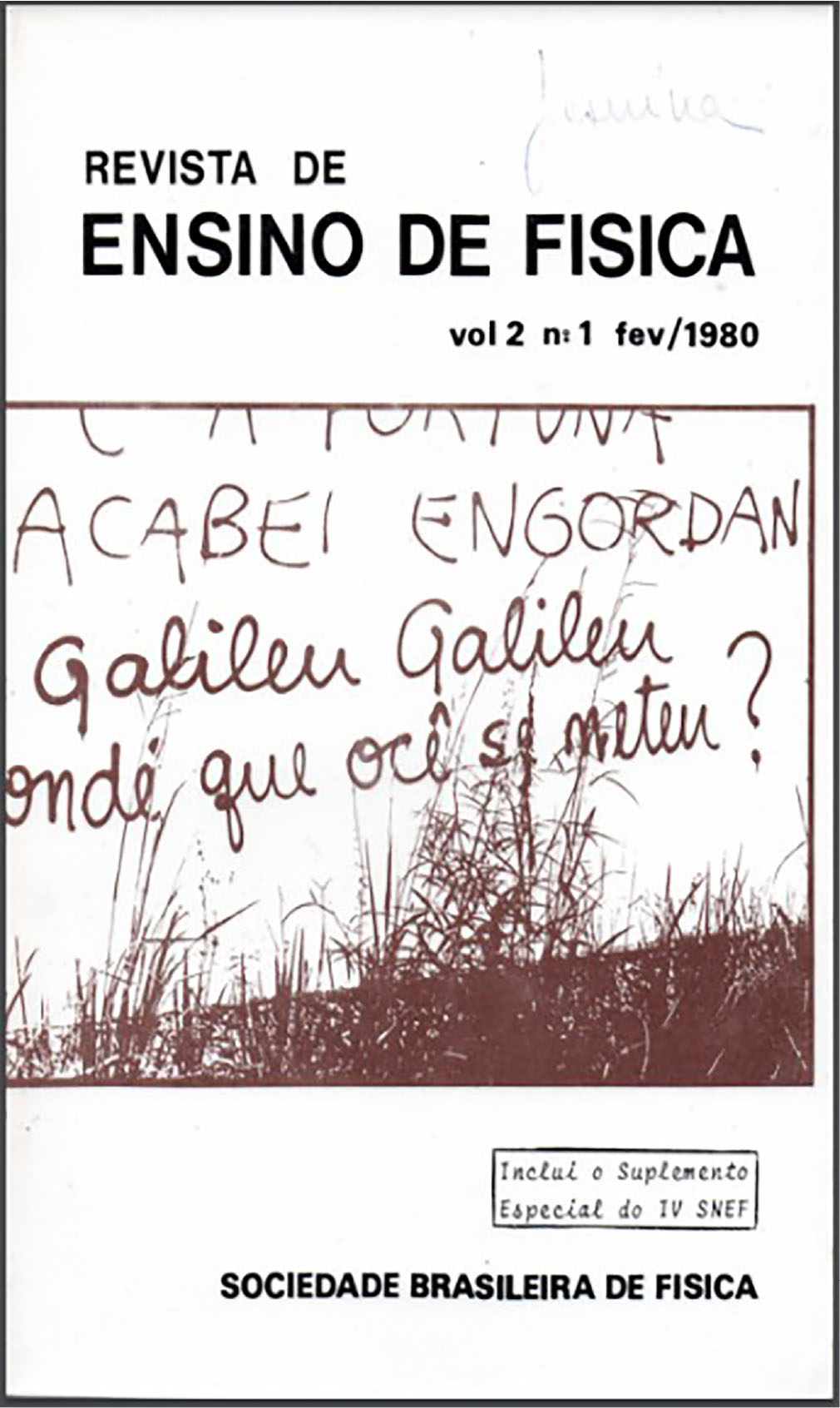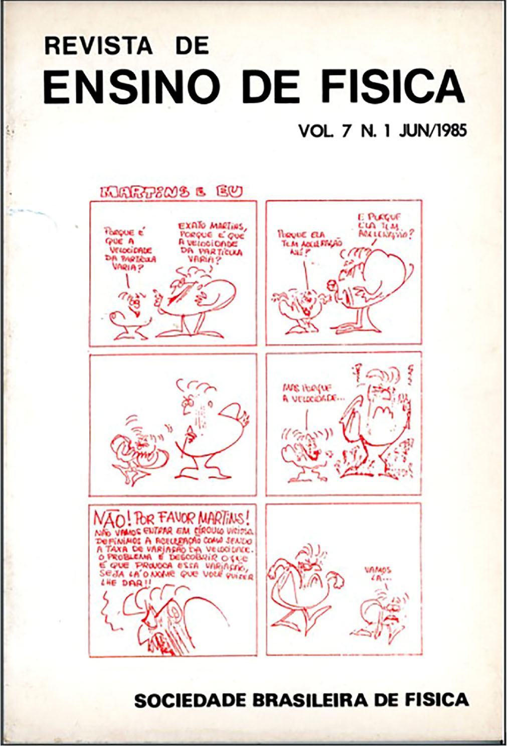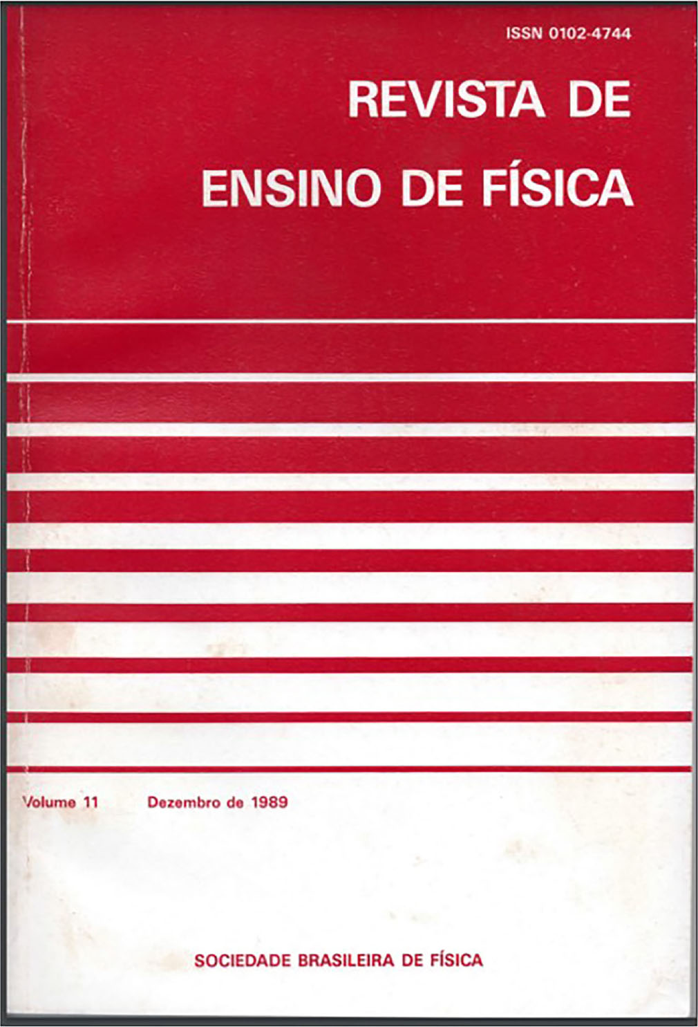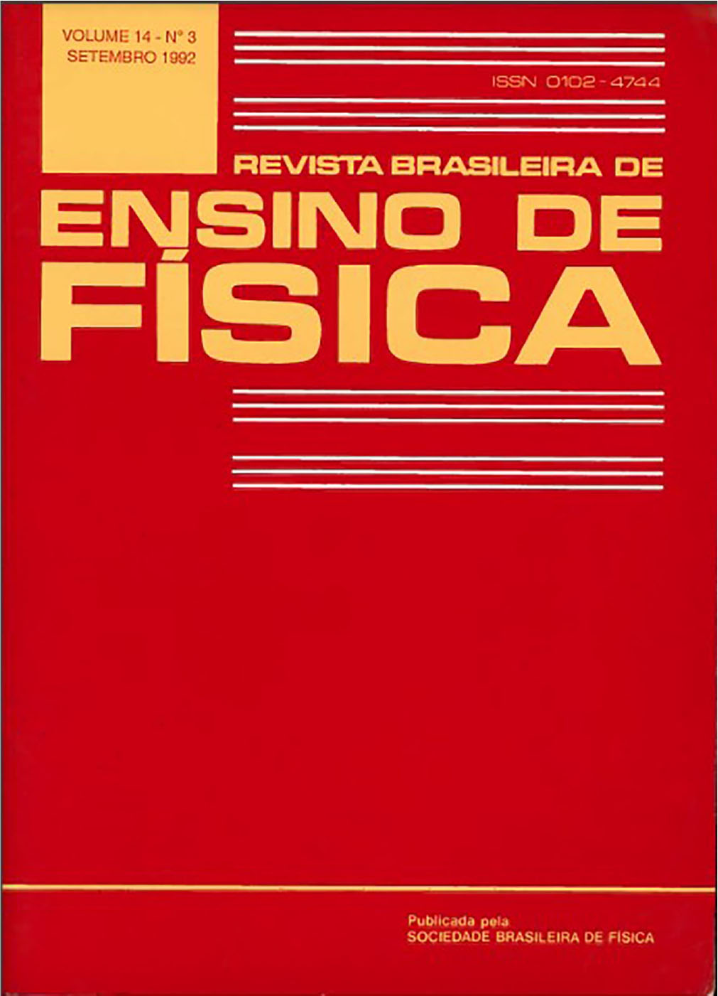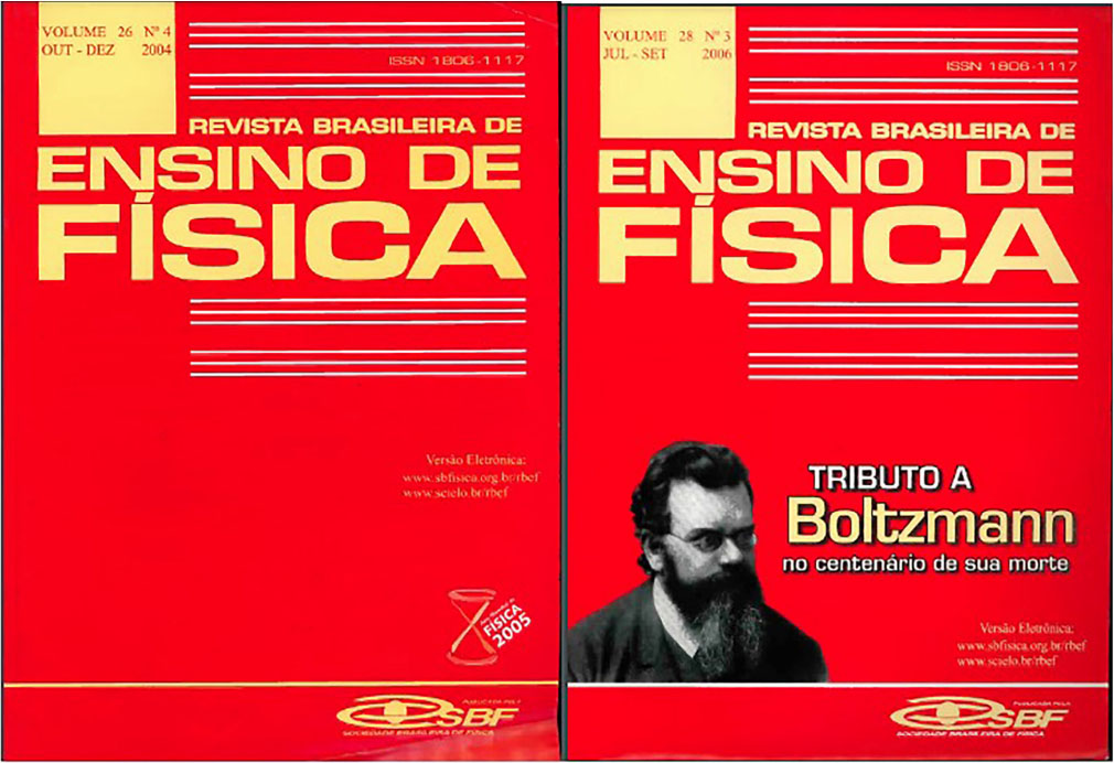
 The covers of the revista brasileira de Ensino de Física over its 45 years: a Semiotic analysis
Abstract
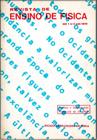
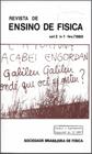
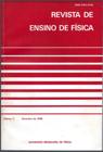
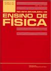
The present research studied the Revista Brasileira de Ensino de Física (RBEF), with the aim of investigating the analytical quality of the visual messages present on its covers throughout its 45 years. The study was conducted based on a Peircean semiotic analysis of a set of the journal’s covers. As a result, three groups of covers were observed: the first encompassing the initial ten volumes of the journal from 1979 to 1988, the second, a transitional phase, including the volumes from 1989 to 1991, and the third starting in 1992 and continuing to the present day. With this article, we were able to understand the historical progression of the visual communication of RBEF’s covers, which, throughout its trajectory, established a visual program identified in three distinct phases: the first opted for a unique visual identity, producing an individual narrative for each cover. The second generated a process of standardization in its communication and informational action. Finally, a third phase emphasized a logotype, constituting itself as a brand, as will be understood in the following reading.
Keywords
Physics Teaching; Semiotics; Image analysis
 Thumbnail
 Thumbnail
 Thumbnail
 Thumbnail
 Thumbnail
 Thumbnail
 Thumbnail
 Thumbnail
 Thumbnail
 Thumbnail
 Thumbnail
 Thumbnail
 Thumbnail